One Way to Visualize NBA Data in Python
Visualizing 2022 NBA Driving Leaders in Python with Pygal and Jupyter Notebook
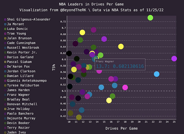
Top-5 NBA Leaders in Drives Per Game
1. Shai Gilgeous-Alexander (25 – 60.3% TS%)
2. Ja Morant (22.5 – 55.4% TS%)
3. Luka Doncic (21.6 – 73.3% TS%)
4. Trae Young (18 – 51.1% TS%)
5. Jalen Brunson (17.4 – 64.1% TS%)
2022 NBA Driving Leaders look to score (PTS%) or pass (PASS%) out of drives
Jrue Holiday, Tyrese Haliburton, and Russell Westbrook stand out for their willingness and ability to kickout on drives, with over 45% of drives ending in a pass.
Orlando is building an offense around 6'10" ball-handlers attacking the rack.
Franz Wagner and Paolo Banchero are each driving over 13 times per game, ranking Top-20 in Volume and Drive TS%.
Franz' 247 Total Drives this season is T-8th in the NBA with Russell Westbrook.
Among NBA Driving Leaders, Franz's 76% PTS% ranks 2nd behind Donovan Mitchell, while Paolo's 69% ranks 6th, revealing two high-volume drivers who looks to score first.


How to recreate these data visualizations in Python with Pygal in Jupyter Notebook!
To create these data visualizations, one must have Jupyter Notebook and all necessary data downloaded to their computers. The data file must be stored in the same folder as the python code file.
To locate and download this data, visit NBAStats.com for the official driving leaders, and copy and paste the desired data into an excel file or google sheets.
To calculate Drive TS%, enter this formula into a cell:
= PTS / (2*(FGA + (0.44*FTA)))
Open Jupyter Notebook by opening Terminal through search bar
→ Type “jupyter notebook” after user$
Full Python Code:
Step 1: Import necessary packages and pygal style for colors.
additional color sytles available at pygal.org
Step 2: Create and Customize XY Chart / Scatter Plot, Store downloaded file in same folder and variable, Create temporary lists to store data
Set variable to downloaded file, file must be stored in same folder
Create XY chart, set stroke to False for scatter plot
customize legend, dot size, color style
Add title, x and y labels, credit source and creator
Create lists to hold data
Step 3: Retrieve data from file with For loop
Loop through file
for each row:
Read in Player Name in column 1, convert type to string, store in variable and list
Read in Drives Per Game in column 2, convert type to float, store in variable and list
Read in TS% in column 3, convert type to float, store in variable and list
Step 4: Add data to Scatter Plot with While Loop
Set counter variable
While loop through all three lists representing each column in each row, adding each point to scatter plot
Increment counter variable
Step 5: Render final image to svg file
Drag and drop svg file into empty url page for interactive data visualization!
How to Recreate the Bar Chart
Most of the code is the same. The only significant difference for recreating the bar chart is the initial creation of the chart.
use bar_chart as variable instead of xy_chart
use pygal.Bar and set x_label_rotation to 20 or desired setting
change captions, titles, variables to match data
use while loop to add data to the chart
confirm sure bar_chart, temporary variables, and list names match throughout all code.
drag and drop svg file into empty URL for interactive data visualization!
Follow @BeyondTheRK on Twitter and YouTube for more basketball film breakdowns, scouting analysis, and data visualizations!
Data via NBA Stats
Pygal.org for more Data Visualization coding tips


