
The Coolest Basketball Data Visualizations Ever Made
Asking people who make cool basketball data visualizations to share the coolest basketball data visualizations they've ever seen and created
Today we are celebrating the analytical art form known as basketball data visualization by searching the interwebs for the most creative data viz ever created.
I asked analysts, fans, scouts, analytic gurus and data scientists to share the coolest basketball data visualizations they’ve ever seen someone else make and the charts they’re most proud of within their own portfolio.
When asked which data scientist makes the coolest basketball data visualizations, many great basketball minds and number crunchers around the field were mentioned: Ben Taylor’s genius breakdowns at Thinking Basketball
Owen Phillips’ F5 Newsletter full of clear and concise charts
Vanna Bushong’s revolutionary animations
Kirk Goldsberry breaking the mold with his book Sprawlball
Peter Beshai’s innovative tools like his Buckets app
Jon Bois’ entertaining deep dives at Secretbase
But one name stands alone as the clear favorite for this exercize, the first name that pops into folks minds when it comes to creative, unique, one-of-a-kind data viz.
Data Visualization, the art form; Crumpled Jumper, the artist.
Among all the data scientists and analytics gurus who visualize basketball data, the name Todd Whitehead popped up most often as the most popular creator in the field for his unique design choices that share information while keeping it fun to learn data.
Todd provides analysis and insight with Synergy and Sport Radar, where he shares basketball data in fun and eye-catching ways.
I asked Todd about appreciating Data Visualization as an art form, especially when it comes to basketball:
Data Viz has a serious purpose: to communicate information in a way that resonates with the viewer on an intuitive level.
It should be trustworthy and actionable, but it doesn't need to be stuffy or boring.
I like data viz that is eye-catching and fun. Compelling data viz can turn on new audiences to a topic like basketball analytics and make it more approachable.
You can find Todd’s work at his Twitter handle @CrumpledJumper and @SynergySST
Todd took this poll question and ran with it, expanding on positive mentions of others’ work in this Twitter thread featuring many of his favorite basketball data inspirations, most of which are included below.
Let’s take a walk down some of Todd’s greatest hits, and all the examples shared with me for this exercize: the graphs, charts, and data viz that remain memorable to this day in the minds of analysts and fans around the game.
Todd Whitehead
Charting an index of postseason excitement using spots of a dairy cow

The Suit Chart

Caitlin Clark’s Record-Breaking College Shot Chart

Courtney Vandersloot’s Dimes

2023 NBA Scoring Leaders from each shot distance

Sometimes, numbers get a bad rap.
Numbers are all around us in everything we do.
In the world of basketball, numbers lead to multi-million dollar decisions.
Data empowers decision makers to have evidence behind those choices.
Data is simply one tool to make better decisions; in basketball, it’s a way to know *what* happened, while the eye test and film tell you how and why it happened.
Not everyone enjoys data; to many, these endless numbers remind them of the math class they hated in high school.
That’s where data scientists who visualize stats step in; to paint a picture using data so people can quickly understand the value, appreciate a colorful work of art, and maybe even learn something useful a long the way.
This chart I made visualizing Every Shot Tracy McGrady took in the NBA is the analytics project I’m most proud of to this day – I taught myself programming tools, python code, tableau design, and then, like following a recipe in a cookbook by learning from others who attacked similar ideas before me, I made it happen.

My data viz on T-Mac above was inspired by the work done at LA Times, where they generate an entire page just to visualize every shot Kobe ever took.

The way numbers, art, and creativity can inspire others to further develop ideas should be celebrated.
Here, I continued builiding upon the project with Every Shot Carmelo Anthony Took in the NBA and Every Shot Dwayne Wade Took in the NBA


Owen Phillips
Owen’s F5 Newsletter is the best basketball data visualization email you can wake up to in your inbox nowadays. One of the most popular answers for this poll, Owen’s done public work for years between pudding.cool and F5, experimenting with all sort of ideas an designs, along with experience working with the New York Knicks.
I asked Owen about appreciating the creativity and challenges behind visualizing basketball data and what the art form means to him:
I like things that look nice and are functional.
When a data viz is good it does both of those things.


Pudding.cool
Ever wonder what an interactive map of every outdoor basketball court in the USA would look like? An entire page dedicated to the color coordination of NBA jerseys?
Puddine.cool has you covered. Go find your local court or search for a new one in your area.
Video visualization on the NBA’s Defensive 3 Seconds Problem: The Floor is Lava
The creative ideas and implementation on this site are bar none, and of course Owen Phillips was a key contributor to making them happen.


Ben Taylor
Thinking Basketball revolutionized the way many understand the sport. Ben Taylor is the author, podcast host, youtube video creator, analytics thinker, cognitive scientist, and data visualization generator behind the scenes who’s built the platform.


Jon Bois
Jon’s detailed videos with @Secretbase and Dorktown offer incredible story telling while keeping the graphs simple to digest while always getting their point across.


Peter Beshai
Peter Beshai’s data visualizations innovated the field at the time they released with incredible interactive tools to explore the world of basketball data like Buckets, Shotline, Scattershot, and NBA 3D.
Todd Whitehead touts Peter as ‘your favorite NBA data viz guy’s favorite NBA data viz guy.’


Vanna Bushong
Vanna puts us mere mortals to shame with her animated data visualizations that you’ll find all over ESPN, often in segments featuring Kirk Goldsberry.
Tracking shots and assists from legendary players like LeBron, Jordan, Kobe and teams like the Houston Rockets, it’s hard for the rest of us to keep up in the Making Numbers Look Cool Department.


Kirk Goldsberry
Kirk’s book Sprawlball broke the mold for normalizing data through the art of visualization, inspiring many folks like myself and those featured in this newsletter to realize that charts can be more than a spreadsheet, that numbers can be expressed in a cool design, and that the average fan may actually want to learn more about the game than meets the eye.


Jacob Weinstein
The FreeDarko books are as creative as it gets.

Shri Khalpada & Rob Moore
The Per Thirty Six website has intuitive tools to play around with data.


Positive Residual
How much information can you squeeze into one chart without overwhelming the viewer? Positive Residual has your answer.


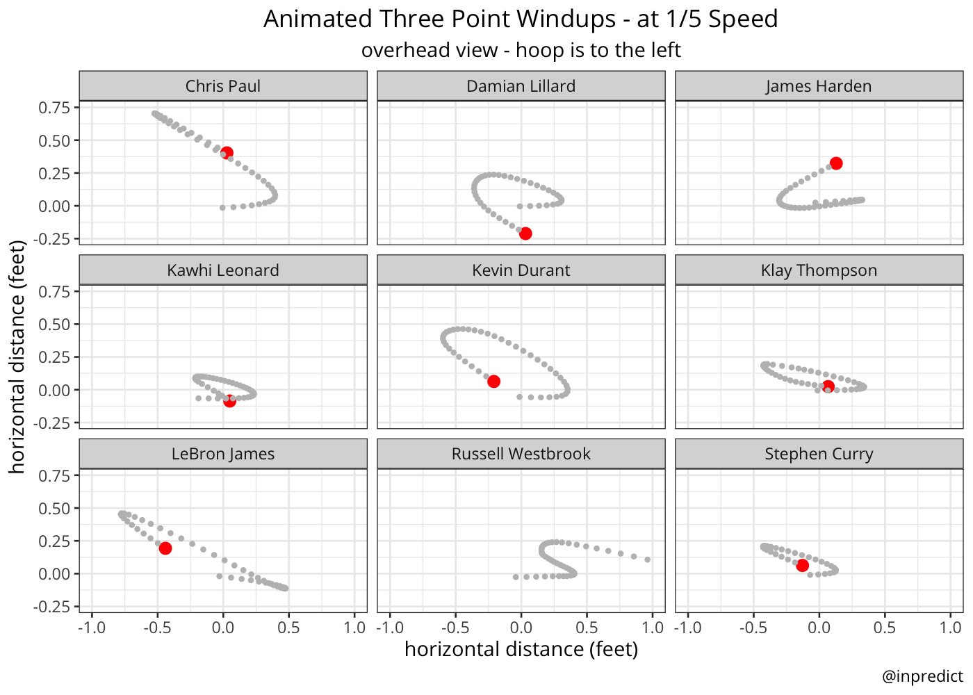
Mike Beuoy
Animated data viz on the overhead version of shot motions for individual players
Krishna Narsu & The BBall Index (@Tim_NBA)
Krishna invented the LEBRON metric, an all-in-one impact stat featured on Tim’s basketball data website, The BBall Index. The site’s tools offer countless ways to measure and visualize basketball data, each categorized in logical ways.


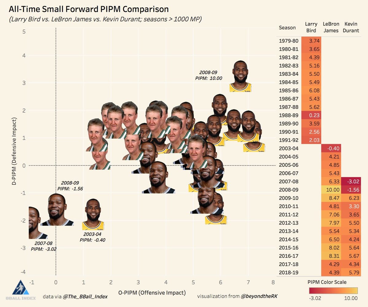
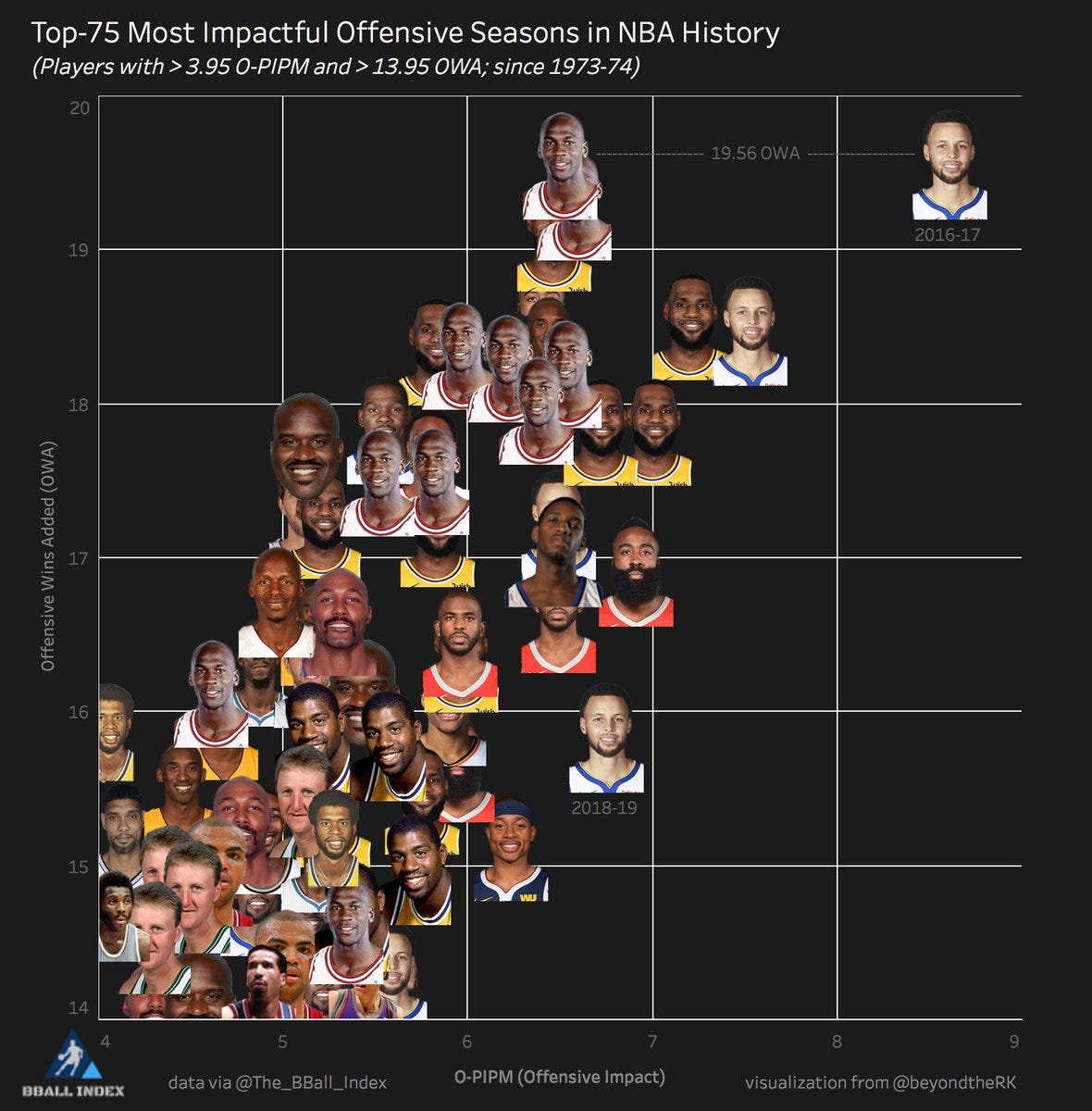
Jacob Goldstein
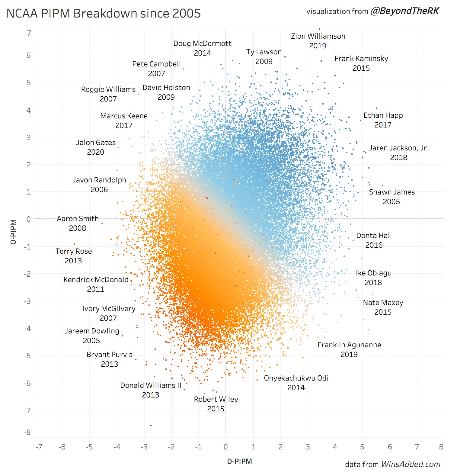
Jacob created the Wins Added website before being hired by the Washington Wizards and Mystics Analytics team. On the public side, Jacob invented the PIPM metric, an all-in-one impact stat that was once available on The BBall Index.
I created some data visualizations with Jacob and Tim at The BBall Index, which can be found at the bottom of this article.


Andrew Patton & Nylon Calculus
Steph Curry popularized the term shooting gravity; have you ever wondered how something like gravity might look like? how you can define the impact of that gravity?
Here’s a visual of Los Angeles Lakers Head Coach JJ Redick’s shooting gravity during the 2018-19 season compared to the median player, showing how the mere threat of his elite 3pt shot pulls defenders out to the perimeter, creating space for the team.

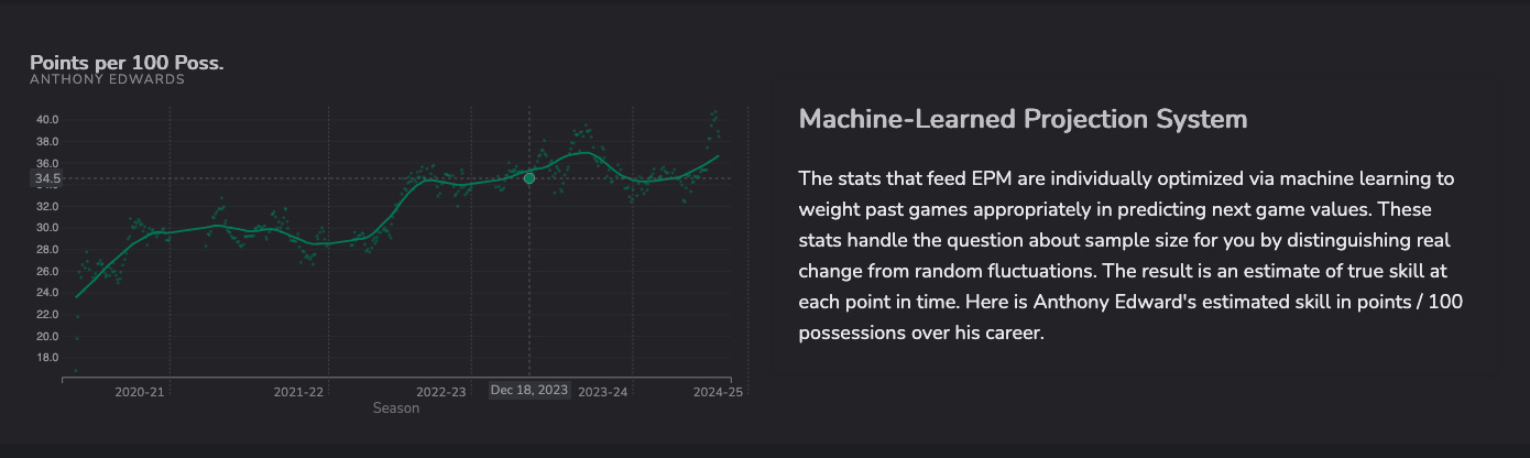
Kostya Medvedovsky
Kostya is the creator of DARKO NBA Projections, revealing impact through a career by age or number of games played, creating a shiny app with Andrew Patton to visualize these results.


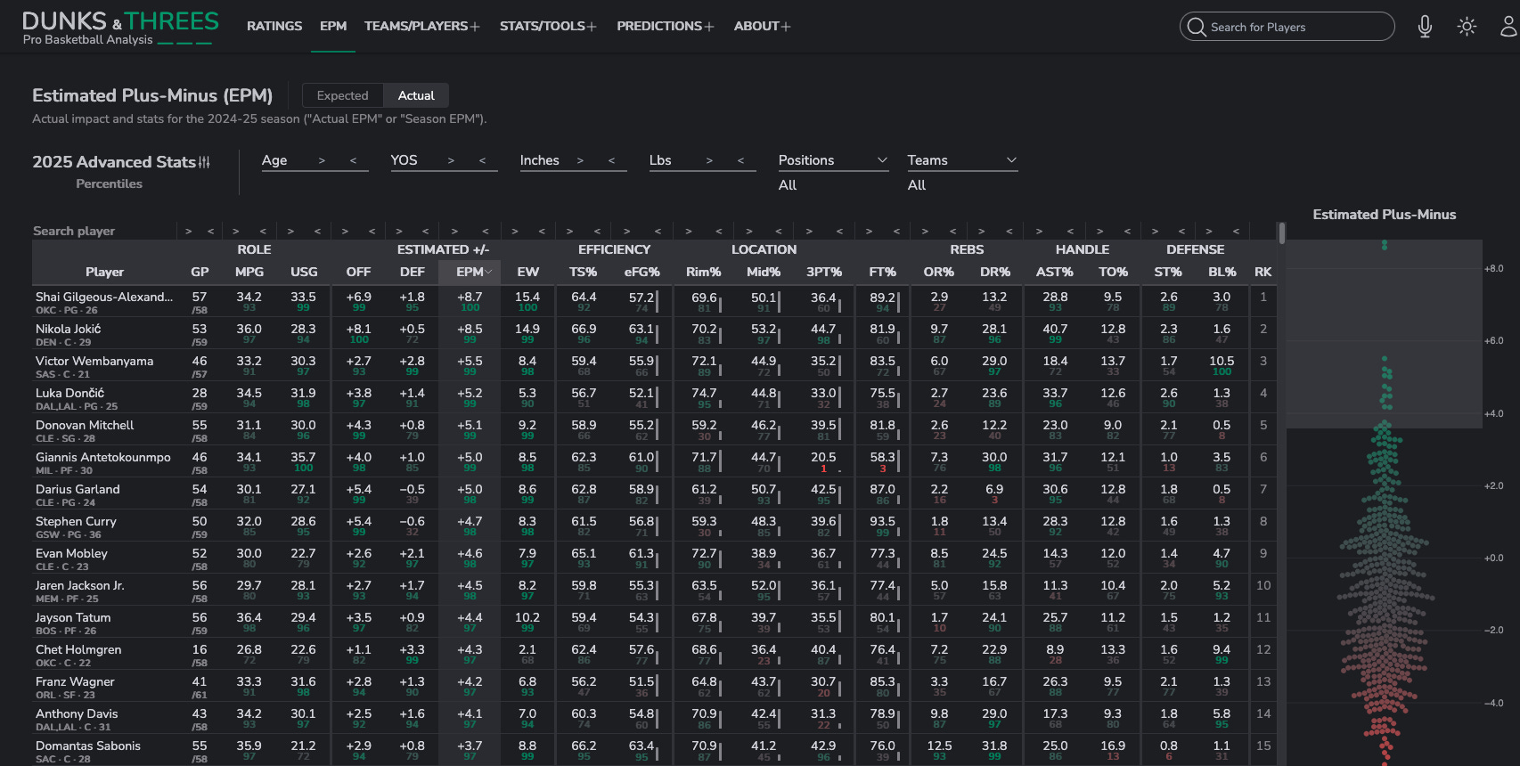
Taylor Snarr
After working with the Utah Jazz, Taylor invented the EPM metric that measures player impact on the court at his website Dunks & Threes, where you can find all sorts of fun tools to play around with basketball data

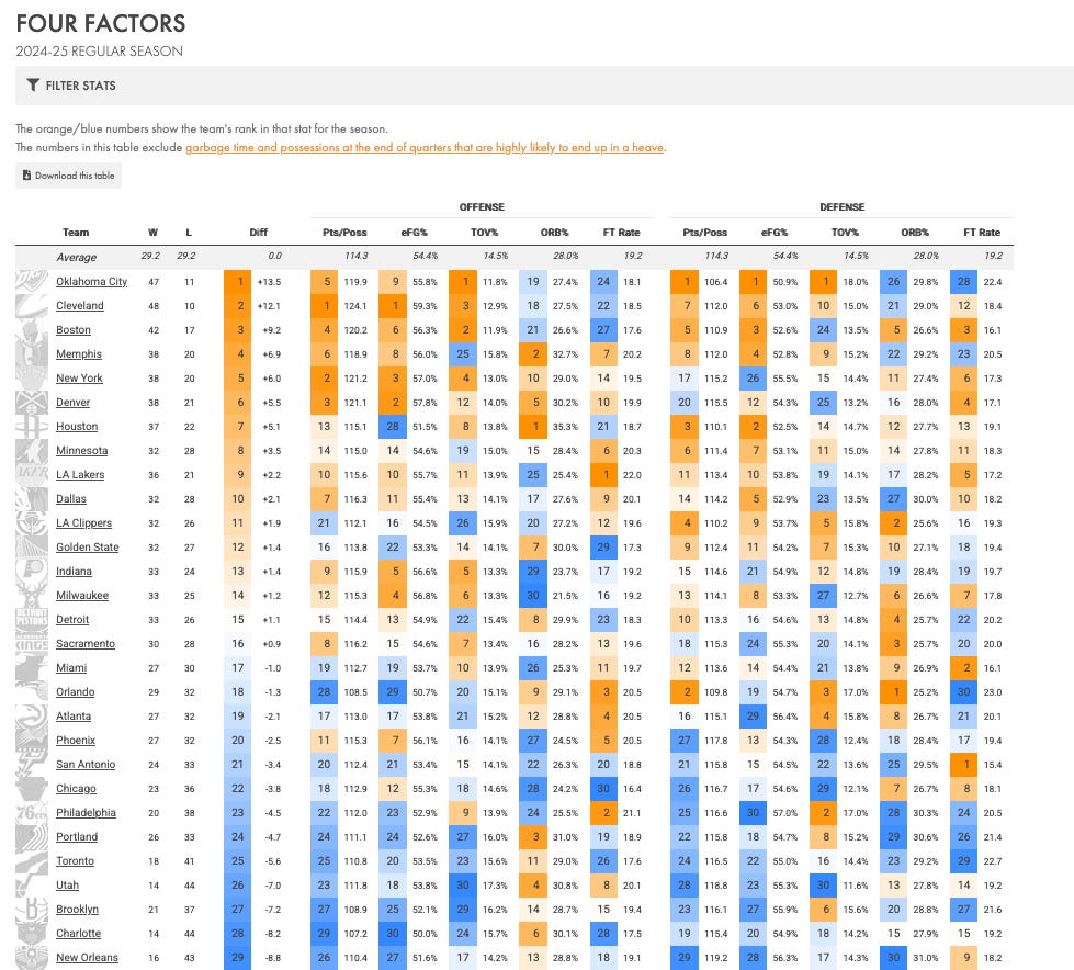
Ben Falk
Ben was previously VP of Basketball Strategy with the Sixers & Basketball Analytics Manager with the Blazers. Now he runs his website Cleaning The Glass to share public and private data with the world, with easy-to-use tools that make finding things like Team Four Factors and percentiles easy to digest.


Seth Partnow
Seth is the author of The Midrange Theory and former director of basketball research with the Milwaukee Bucks


Dom Samangy
Dom makes some of the cleanest data viz around, so clean in fact that he got hired by the New Orleans Pelicans to be their Basketball Analytics Coordinator after working with the Arkansas and Syracuse college basketball programs.
Dom put together this detailed guide to learning sports analytics that’s accesible for anyone.


Evan Miyakawa
Evan Miyakawa invented his college hoops analytics website EvanMiya.com that creates fun interactive dashboards for nba draft prospects, college teams, and college players on a comparable scale.


Lev Akabas
Every NBA MVP ever, in three charts


Nathan Yau
3D-printed Shot Charts

Yu Fu Tory
Colorful. Creative. Charts.

JP Hwang

Gabriel Guzman
Check out his website nbavisuals.com

Roshan Potluri


Maurya Kumpatla


Matt Powers


Adam Pike & Keaton (@Tonsofkeas)

Riley Gisseman
How much is a two pointer worth?

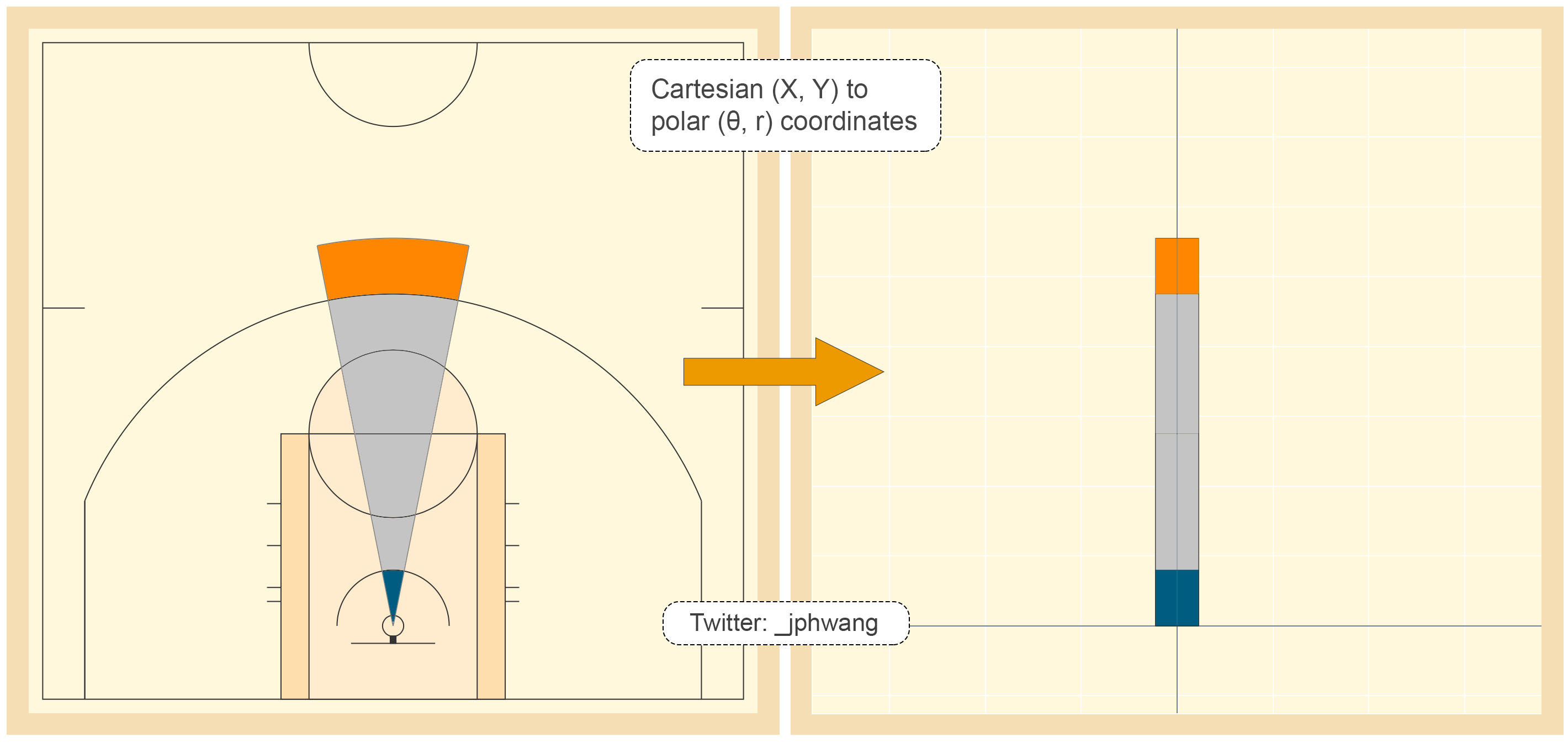
JP Hwang
the “polar” coordinate system to fix shot charts
Jonathan Safir
Ever wonder which situations your team should foul in a close game? Jonathan Safir did the math for you


Saurabh Rane


Edoardo Vergani

Senthil (@Senth1s)

James Naismith
Is the inventor of the sport of basketball also the inventor of basketball data viz?

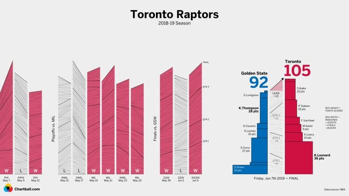
Chartball
Magnus
Johannes Becker
https://fansided.com/2015/07/21/an-nba-players-comfort-zone/
FiveThirtyEight


Sravan (@Sradjoker)
Sravan was so inspired by Todd’s chart on Kevin Durant Scorigami that Sravan created a shiny app to create similar visualizations with other players.


Thank you to all the smart minds who helped put this together by sharing the coolest basketball data visualizations they’ve ever seen or created.
Here’s some fun designs from my own portfolio that I’m proud of, including some of my work with Jacob Goldstein, @Tim_NBA, and The BBall Index team back in the day.


Such a fun read, thanks for putting it together!
Simply awe inspiring! Thanks for putting this together, Ryan.